WhatsApp

Review Lustrous Lenormand from Ciro Marchetti + Toni Savory

DATASHEET
Name : Lustrous Lenormand
Author : Ciro Marchetti + Toni Savory
Publisher : Editions Exergue
Tradition : Petit Lenormand
Packaging : Hard cardboard bell box / 17.2 x 12.6 x 4.2 cm / 6.7 x 4.72 x 1.57 in
Deck : 44 cards / thick, glossy, satin / 10 cm / 3.33 in x 5.7 cm / 1.96 in
Size : Poker
Handbook : Leaflet of 203 pages in color
Reverse side : No, the backs of the cards are not reversible.
Switch of 8/11 : No
Universe : Contemporary
Use : Prediction , Voyance
alternative
WARNING
warning Please note: this review is based on material in French. This does not change the content of the review in any way, as the material is identical in both languages. Sorry I can't systematically offer me my tarot cards and books in both languages (I don't receive any gifts from the publishers) ! ^_^

The Material

The Material

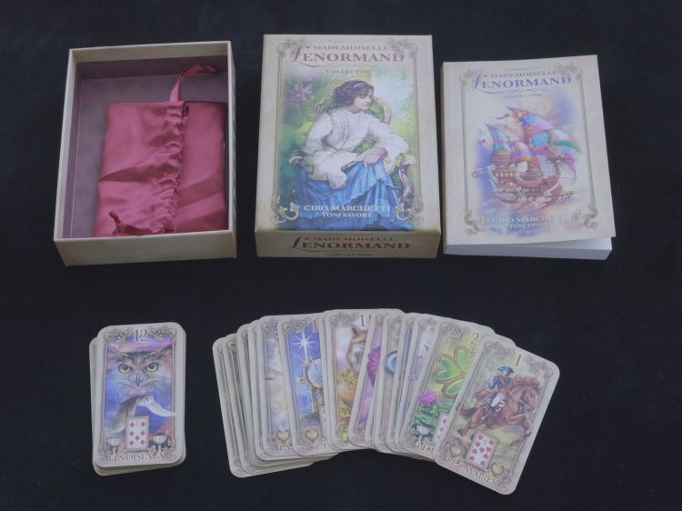
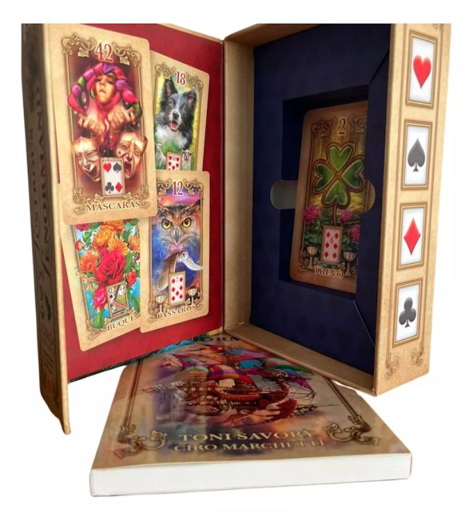
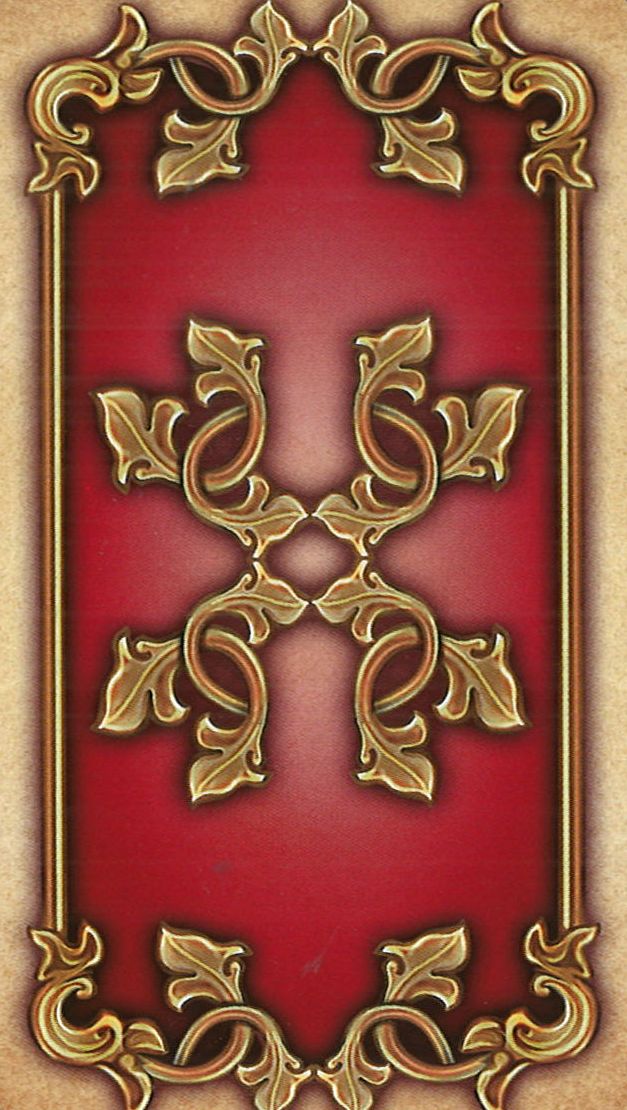
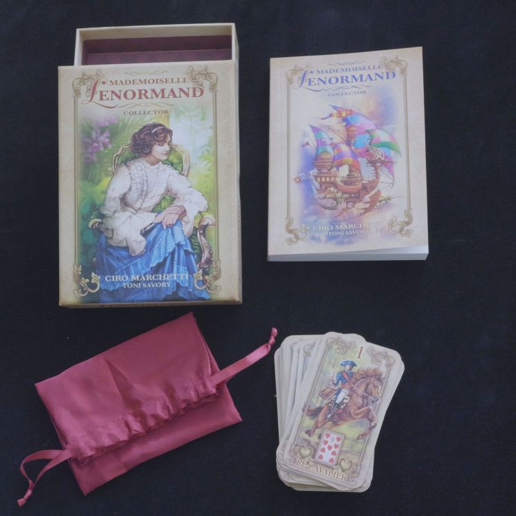
The Material The Lustrous Lenormand card deck by Ciro Marchetti stands out from the moment you open the box, crafted from sturdy material and decorated with a heart-diamond motif, adding an elegant touch. Inside, you'll find a red silk pouch, perfect for protecting the deck. The accompanying booklet is not to be overlooked: it measures 16 x 11.5 cm and contains 203 pages in color, making it a valuable visual guide for users.

The effort to produce quality materials is undeniable. However, a few points temper this positive first impression.

The Cards The cards themselves are distinguished by their satin finish and matte texture, providing a pleasant touch and a luxurious look. Their thickness also adds to their sturdiness. But here arises a first noticeable issue: they do not follow the standard poker card format, being slightly larger. Poker cards generally measure about 9 centimeters high, while those in the Lustrous Lenormand are 10.

This size difference, combined with an almost double thickness compared to a classic Lenormand deck, presents handling challenges. On one hand, the height and thickness of the cards make them difficult to hold, especially for small hands or for those who like to shuffle frequently. On the other hand, the cards tend to stick slightly to each other, making it harder to shuffle and spread them on the table.

Thus, despite the quality of materials and the careful aesthetic, using the cards can become laborious. In conclusion, while the choice of materials and finish of the Lustrous Lenormand show a genuine attention to detail; the size, thickness, and texture of the cards make their use less pleasant compared to other Lenormand decks that are less premium in packaging but have thin cards that slide easily in the hands. What a shame!

The English edition

The English edition

I do not have the English Edition, but I read about it. It seems that the cards have the same problems : too thick for mixing, too large for Grand Tableau ... If you disagree with me, do not hesitate to leave me a message 😉

The Author

Ciro Marchetti is a British graphic designer and illustrator of Italian origin. After graduating from Croydon College of Art in England, he began his career in the field of graphic design and illustration.

Since 1992, Marchetti has been based in Miami, Florida, where he serves as president of Graform International, a design group with affiliated offices in Caracas and London.

Among his recent projects, notable works include:

  • Creating the giant illustration for the world's largest puzzle (33,600 pieces, 2x6 meters) for Educa Boras in Barcelona
  • A series of covers for the "Armchair Reader" collection
  • The 21 covers for the classic series "Famous Five" by Enid Blyton
  • Illustrations for Toyota Landcruiser commissioned by Saatchi & Saatchi Sydney
  • A poster for the "Turtle World" water park at Seaworld in the United States

Work on Tarot and Oracle Decks

Marchetti is particularly recognized for his work on tarot and oracle decks. He notably created "The Gilded Reverie Lenormand," an oracle that enriched and modernized the traditional Lenormand system. In this deck, he added symbolism to the classic cards and created 8 new cards to broaden interpretive possibilities. Thanks to his artistic talent and ability to enhance traditional symbolism, Ciro Marchetti has become an important figure in the world of modern tarot and oracle decks.

The history of the game

Mrs Lenormand's story is rather well known, there is even a Wikipedia page about her life. We know that Marie-Anne-Adélaïde Lenormand was born in 1772 from a humble origin. Apparently from childhood she showed great imagination and curiosity, sharpened by a lively mind. Raised in the royal abbey of the Benedictine ladies of Alençon, she began to give prophecies at a very young age. The perspicacity and truthfulness of these predictions made her not only noticed but also dismissed. She then went up to Paris in the middle of the French Revolution, opened a bookstore which became a clairvoyant cabinet. She had her first successes there before she was suspected and then locked up by the Committee of Public Salvation. However, she managed to make her way through the times and took advantage of each change of regime, the Empire under Napoleon and then the Restoration with Louis XVIII, to establish her prestige and her fortune. Did she really have a talent for clairvoyance? Perhaps. But it is certain that she had a great finesse of mind in the game of intrigue, a real ability to seduce her clientele, and a true sense of business and entrepreneurship. Some specialists also say that she had built up a real network of informants throughout Paris that allowed her to be very well informed about her customers and therefore to refine her predictions.

However, we have very little information about the games she used during her consultations. However, it is commonly accepted that she based her spreads on a set of 32-36 French sign cards (Club, Spades, Heart, Diamond) on which she could write annotations. It is said that she could have been inspired by the divinatory game of the German Johann Kaspar Hechtel (1771 - 1799) whose 36-card deck known as "Das Spiel der Hoffnung" (The Game of Hope) was first published in 1799. However, it is likely that Lenormand was inspired by Eteilla's game. Indeed, upon her arrival in Paris, Marie Lenormand met a fortune-teller named Mrs. Gilbert, who taught her the divinatory tarot grace of Etteilla (1738 - 1791). Eteilla printed her tarot for the first time in 1788-1789.

The booklet

The booklet
The booklet

The Lustrous Lenormand booklet is divided into three distinct sections:

  • The Lenormand System: This first section focuses on an introduction to Lenormand practice and divination. It explains what it means to read the cards, as well as the concept of significator cards like the Man and the Woman. It’s a general approach that guides the beginner in understanding the basics of Lenormand.
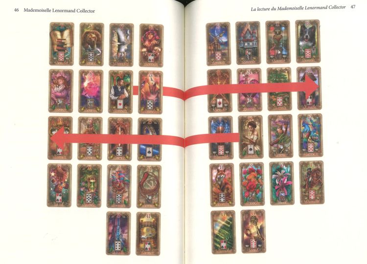
  • Reading methods: Several types of spreads are offered, such as the single card reading, the three-card reading, the six-card spread, and the nine-card spread. However, each method is only covered in one page, which limits the depth of explanation. It might have been more relevant to focus on a specific spread, like the nine-card, and develop it further over several pages. Nonetheless, a real effort is made for the Grand Tableau, with about thirty pages dedicated to this iconic Petit Lenormand method. This level of detail is rare for a Lenormand deck booklet and includes several illustrated examples. While more in-depth teaching would be appreciated, this focus on the Grand Tableau is a definite advantage of the booklet.
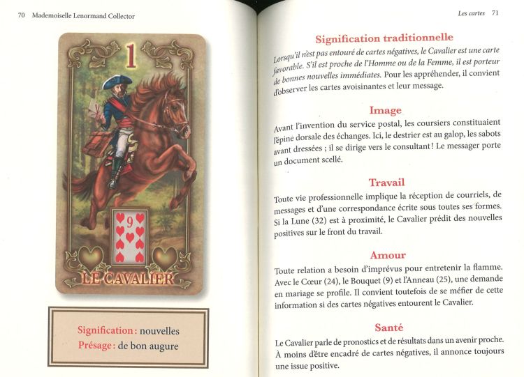
  • Card meanings: This last part is dedicated to the 36 cards of the Petit Lenormand. Each card is given three pages, including an image, two main keywords, and a detailed analysis of traditional symbolism in the areas of work, love, and health. There are also additional keywords, advice, and a notes section for further information.

To summarize this booklet, two elements stand out:

  • Importance of significators in the Grand Tableau: The booklet also highlights significator cards, a tradition unique to Lenormand. Unlike tarot readings with fixed positions, the significators in Lenormand are used to represent specific elements of the question asked. This approach is interesting as it differs from the usual positional readings in the Rider-Waite-Smith Tarot.
  • Summary table: A summary table is included in the center of the booklet. It provides one keyword for each card, which is convenient for quick reference. That said, offering several keywords per card would have added more depth and made interpretation easier for readers.

Critical analysis:

The booklet presents interpretations by themes (work, love, health), which is appreciated. However, the descriptions remain quite simple and may seem insufficient for more advanced users. Given the booklet's length (over 203 pages), the space could have been better optimized to add more in-depth explanations. The layout allows plenty of room for images, which limits the amount of text content. So, while this booklet is well-suited for beginners, it may quickly become restrictive and encourage users to seek other resources to deepen their knowledge.

In conclusion, this booklet provides a solid foundation for those starting with Lenormand, notably thanks to the detailed section on the Grand Tableau. However, it suggests untapped potential or seems like unfinished work, preventing more advanced understanding. Therefore, the booklet’s usefulness may be limited over time.

The deck’s unique feature: Direction of gaze

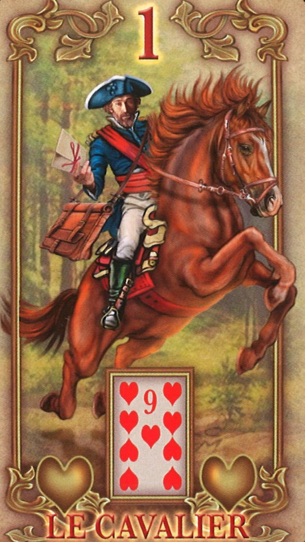
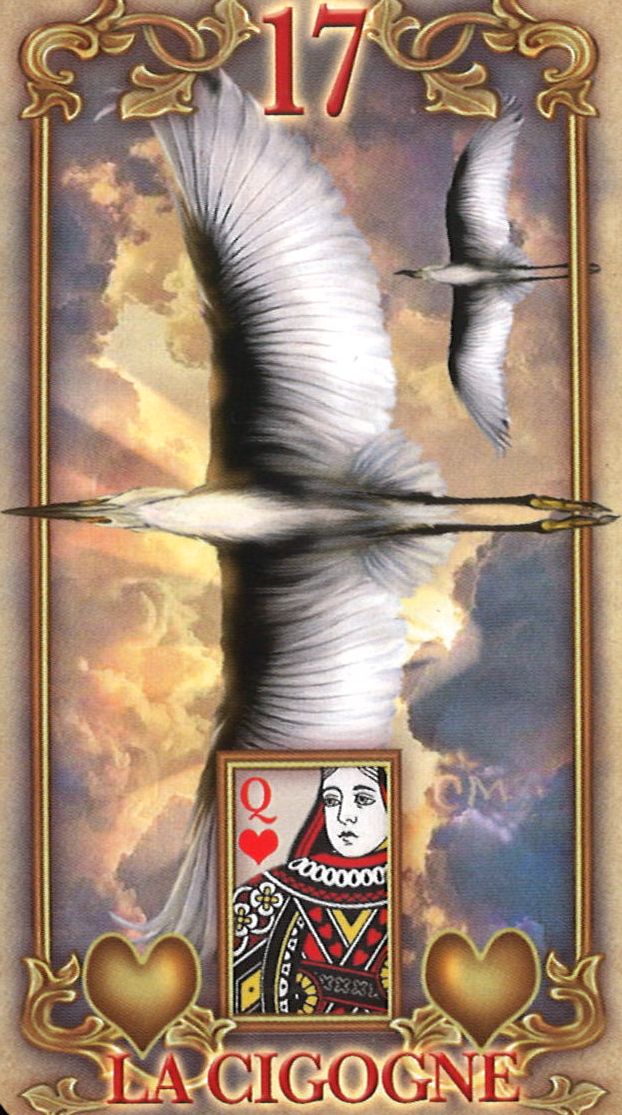
The booklet introduces the concept of character gaze direction, a well-known idea in the Tarot of Marseille but less often applied in the Lenormand system. For example, the Man or Woman card may look to the left or right, and some cards, like the Birds or the Rider, also show a direction. This refreshing perspective brings a more modern approach and can complement or replace the “near/far” method used in Lenormand.

alternative
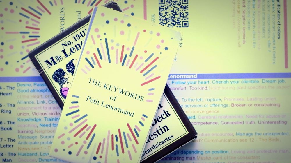
A free PDF to print, cut out, and fold!

Keywords for the 36 cards of the Petit Lenormand, to slip into your favorite deck. Your leaflet always with you, at hand, to guide you in your readings. Thanks to it, your interpretations gain in richness and subtlety.

The Cards I Love

6 - The Clouds

The Cards I Love

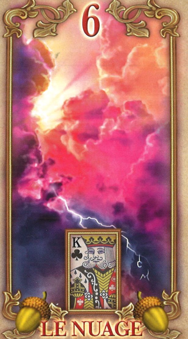
Usually, this card is represented by gray, black, and stormy clouds, symbolizing confusion and difficulty. Here, the artist offers a very different version, with psychedelic colors such as red, orange, and purple. Lightning is still present, but there are also rays of sunshine, giving it a more neutral and less negative feel. I appreciate this vision, which makes the card less dark and more open to varied interpretations.

7 - The Snake

7 - The Snake

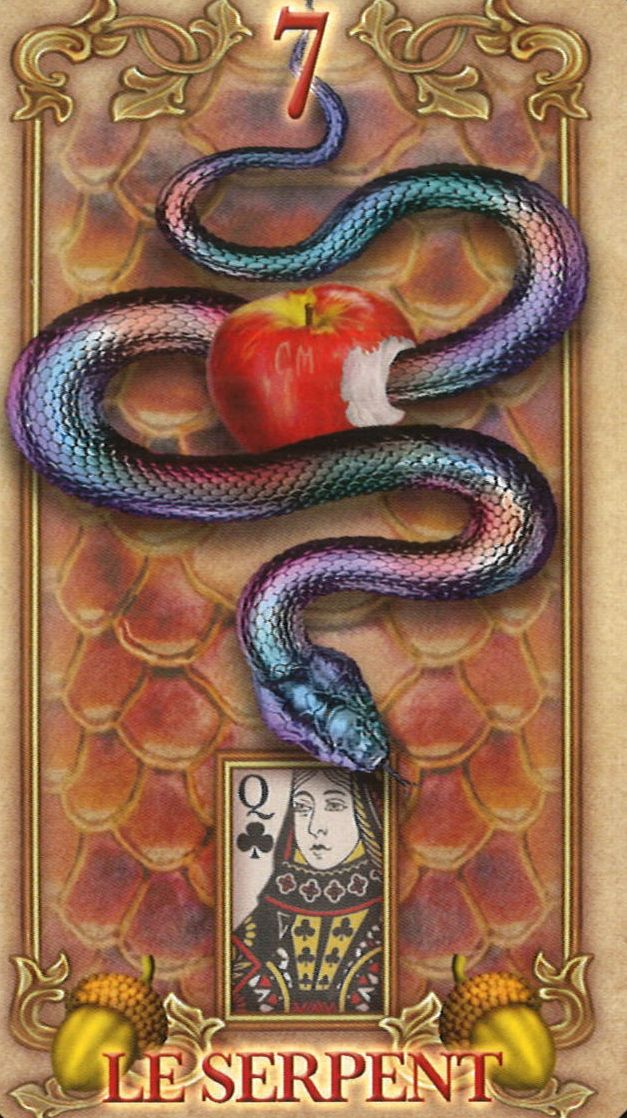
What I like about this card is the presence of a bitten apple, which references the myth of the Garden of Eden and the forbidden fruit. This allusion adds symbolic depth, reminding us of temptation and knowledge. In the booklet, it explains that this apple evokes the forbidden fruit, but it is essential to note that the snake depicted here is not a viper, often associated with betrayal and manipulation. Instead, the snake symbolism includes rebirth, transformation, and clairvoyance.

8 - The Coffin

8 - The Coffin

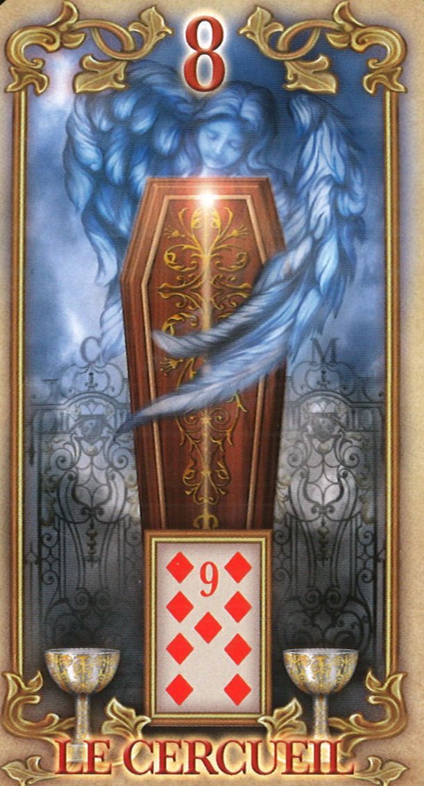
I appreciate the artist’s attempt to not emphasize the negative aspect of this card. Above the coffin, an angel with an outstretched wing seems to protect it, giving an impression of kindness and purity. However, in the booklet, the interpretation of the card remains focused on misfortune and endings without mentioning the presence of the angel. This discrepancy between the illustration and text is unfortunate, and it seems the artist and author did not always share the same vision for the deck.

10 - The Scythe

10 - The Scythe

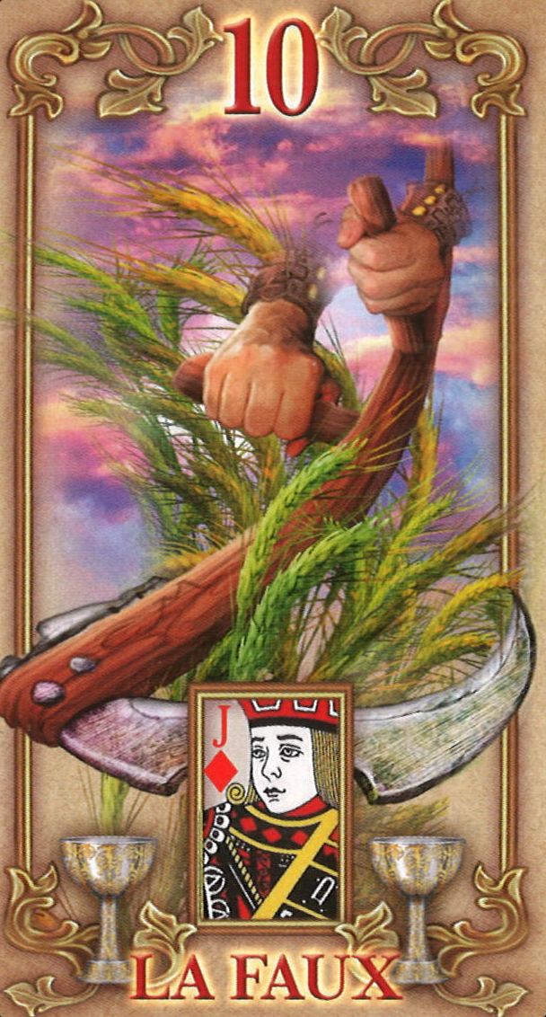
In this card, the scythe cuts wheat stalks, some of which are still green, symbolizing crops that are not quite ripe. This ambivalence intrigues me: should we cut something immature? Yet, the text describes a scythe cutting ripe stalks, while the image shows green stalks. This inconsistency is noticeable and perhaps reflects imperfect communication between the artist and author.

12 - The Birds

12 - The Birds
12 - The Birds

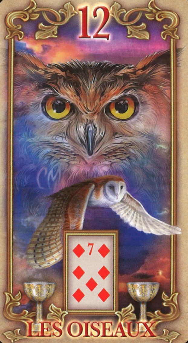
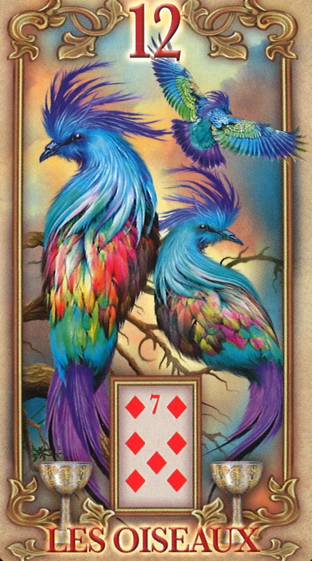
Two versions of the birds card are offered: one depicts an owl and a night owl, symbolizing inner listening and wisdom, while the other shows colorful exotic birds, evoking appearance and the effort of socialization.

18 - The Dog

18 - The Dog

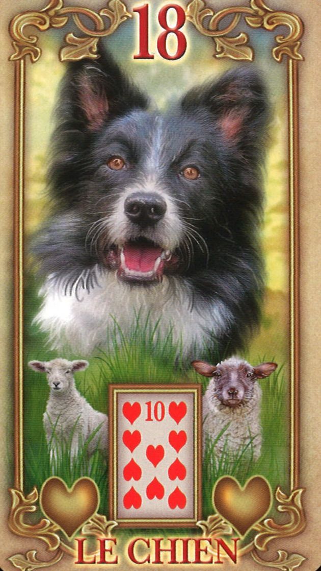
Here, the dog is depicted as a shepherd guarding a flock, symbolizing protection, security, and responsibility towards others, beyond mere loyalty and faithfulness. This iconographic choice enriches the meaning of this card, bringing it additional depth that broadens the range of possible interpretations.

The cards I like less

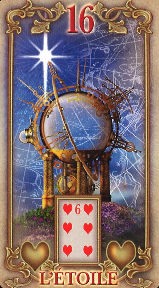
16: The Star

The cards I like less

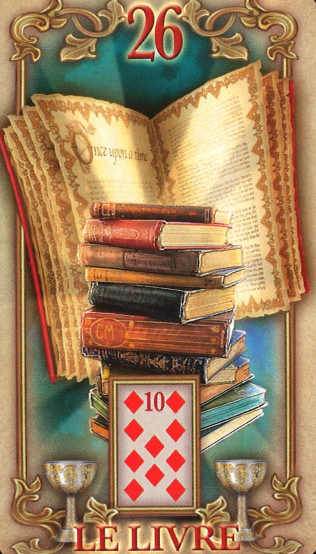
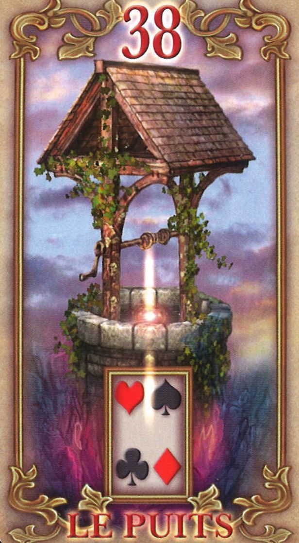
I find this card problematic because the star is represented in a very subtle way, almost insignificant. The card shows an instrument, but it's not clear if it's a globe or a crystal ball. The booklet simply mentions an "instrument" without explaining its function or how it is supposed to help with prophecy or personal growth. The link to the concept of prophecy is vague and lacks clarity, especially since this symbolism is meant to be specific and inspiring. For me, the Star card should embody something more explicit and less mysterious. If we talk about mystery, I would associate it more with 26 - The Book than with The Star.

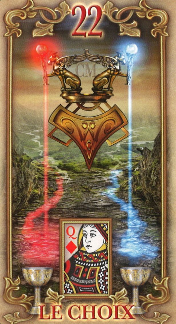
22: The Paths

22: The Paths

Here, the image takes a very esoteric turn, with two dragons holding a torch projecting a ray of light towards the ground. To me, these creatures look more like canines because of their snouts, even though the booklet describes them as "winged cats." This dissonance between the text and the image creates confusion. For me, the The Paths card should evoke a simple fork with two clear directions. An image of a path splitting in two with signs indicating left and right would be much more intuitive. Here, this overly complex symbolism does not facilitate interpretation.

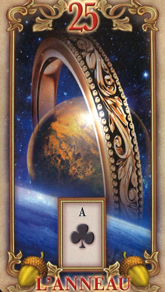
25: The Ring

25: The Ring

The choice of representing a ring orbiting a planet is unusual, as if the ring symbolized Saturn's rings. The booklet mentions a ring orbiting Earth, embodying universal laws and principles that unite humanity. This interpretation seems disconnected from the traditional idea of a ring as a symbol of contract or alliance. Although this choice expands interpretative possibilities, for me, this universal theme would have been more coherent with the 36 - The Cross card, which symbolizes higher principles and laws. Observing the image, one could even confuse this planet with Jupiter or Saturn, while the text refers to Earth.

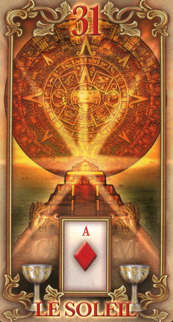
31: The Sun

31: The Sun

The Sun card here is depicted as an Aztec temple with a solar disc at the top. The booklet mentions a sundial, but this is not represented in the image, where we see a solar disc representing the Aztec pantheon instead. Once again, there is a mismatch between the text and the image, which is unfortunate.

32: The Moon

32: The Moon

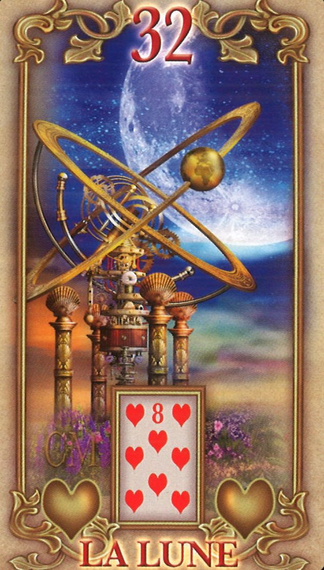
The Moon is shown in the background, while in the foreground there is an astrolabe, even though the text does not clearly explain the use of this instrument. This astrolabe dominates the illustration, almost completely overshadowing the Moon itself. It raises questions about why such an instrument is highlighted, making the card confusing and nebulous in its interpretation. In fact, the descriptions in the booklet for The Star and The Moon could almost be interchangeable, as they lack precision.

33: The Key

33: The Key

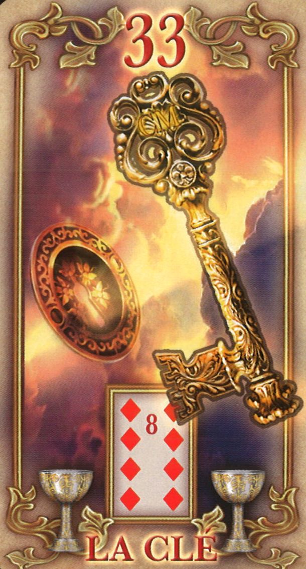
On this card, the key is associated with a lock, but the keyhole is represented so small that it could easily be mistaken for a coin or medal. You have to look closely to see that the metal disc in perspective has a keyhole, a detail that is essential for this card's symbolism. This image would have gained clarity with a more obvious lock.

36: The Cross

36: The Cross

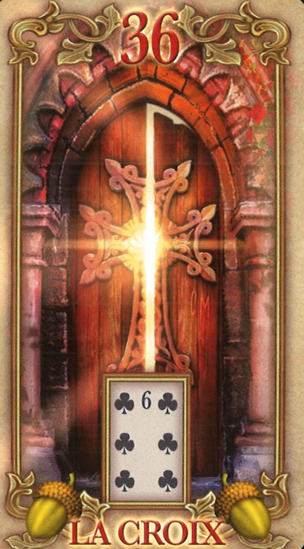
I appreciate the illustrator's effort not to emphasize a negative interpretation. Here, the cross is integrated into the metallic ornaments of an arched door, with a sunbeam in the background. You need to look closely to see the cross, as the door itself draws more attention than the cross. In my opinion, a more visible cross would have strengthened the symbolism.

GALLERY
Be free to
download the complete gallery

My opinion on Lustrous Lenormand

I must say I'm overall disappointed with this deck, and for several reasons.

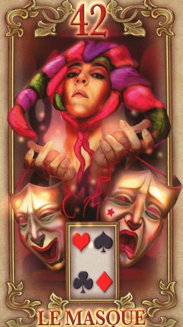
First, from a material standpoint, the cards are thick and don’t shuffle easily, making them hard to handle. Additionally, while the illustrations are undeniably beautiful and artistically well done, they suffer from an excess of detail that harms the readability of the images. When only a few cards are laid out, it remains manageable, but once working with the Grand Tableau of 36 cards, this visual overload becomes a major hindrance. The deck then becomes confusing and interpretation challenging, as it’s hard to distinguish each card at a glance.

In the end, while this deck may be a visual delight for aesthetic enthusiasts, I fear it quickly shows its limitations, especially for beginners who need a simple, clear deck to explore various interpretation levels freely.

I also notice a clear lack of communication between the illustrator, Ciro Marchetti, and the booklet author, Toni Savory. It appears that the author, when interpreting the images, didn’t fully grasp the spirit of the Petit Lenormand, leading to contradictions between text and illustrations, which is unfortunate for a deck of this quality.

In comparison to the Gilded Reverie Lenormand (review here), one of Ciro Marchetti’s other flagship decks, a notable difference emerges. The Lustrous cards are indeed smaller, which could ease the use of the Grand Tableau. However, the dimensions of the Gilded Reverie, while larger than standard poker size, remain more functional. Moreover, the Gilded Reverie succeeds in offering balanced, enriching illustrations for interpretation, whereas the Lustrous loses this balance with an excess of detail.

In conclusion, although one can understand Ciro Marchetti’s idea of offering a different Lenormand deck, perhaps in a more compliant format, it seems that this goal is only superficially achieved. The cards, while adopting a standard poker format (or nearly so), remain thick, sticky, and visually overloaded, making them cumbersome and unintuitive to use.

Learning the Petit Lenormand:
"A disappointing Lenormand" Tweet
TYPE OF USE
  • Prediction
  • Voyance
PROS
  • A booklet presenting the Grand Tableau, the flagship spread of the Petit Lenormand
CONS
  • Slightly too tall cards, but mainly thick and that don't slide easily. Unpleasant to use!
MATERIAL QUALITY RATINGS
4
/5
Quality
Packaging
1
/5
Quality
cards
4
/5
Rating
Artistic
EASE OF INTERPRETATION RATINGS
1
/5
Richness
of symbolism
2
/5
Legibility
of cards
1
/5
Structure
level
EASY-TO-USE RATINGS
2
/5
Ease
of use
4
/5
Accessible
to children
2
/5
Interest
in the study
OVERALL RATING
2.3 / 5

To go further, continue your reading with ...

Comments

Subscribe to the newsletter :